Launch: a new registration and enrollment system for UPUMC
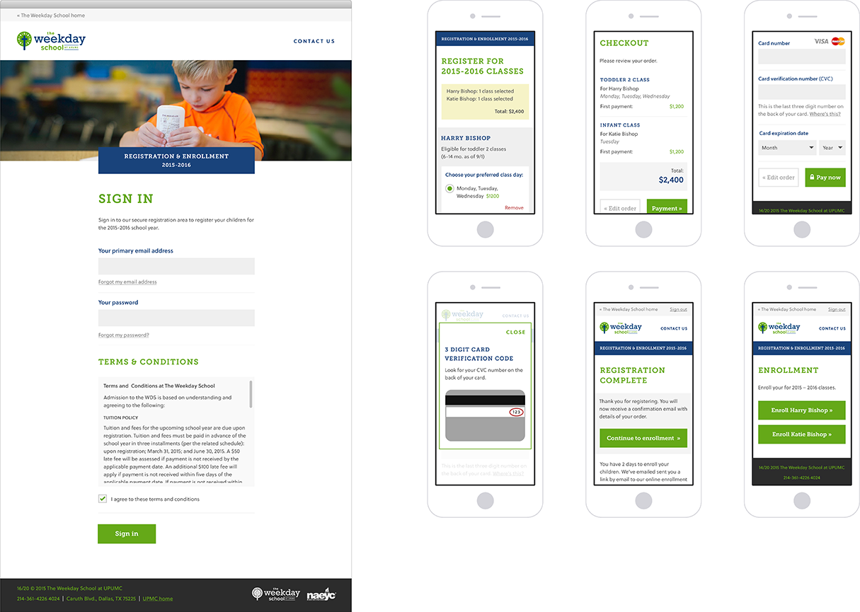
We recently partnered with Switch Creative and The Weekday School at UPUMC to make an easy-to-use, mobile-friendly registration and enrollment system for the 2015–2016 school year. :100:

Not to choose favorites, but this might be my favorite Good Work project so far. It falls right in line with the type work we excel at, and was our first meaty Dallas project after the big move.
So, without further adieu, here are some quick notes on our first school registration system project and the process we took to get to the finish line:
Solving a real problem
Successful software projects solve real world problems and make people’s lives easier.
Registration day for limited availability day schools is a stressful time for all parties involved. Parents camp out in parking lots and administration is flooded with calls and emails. Our task was to make this easy.
From zero to registration in just 3 months
With a Kick-off call in late September, the holidays approaching and a hard registration date for early January, there wasn’t much time to spare.
Through a series of workshops with the team, we were able to quickly transform ideas into an assortment of site maps, user journeys and wireframes that we could start to build on.
We then produced a series of linked, low-fidelity wireframes using InVision, which allowed for quick usability tests and rapid iterations. This stage brought out new ideas, new problems to solve and better ways to solve them. For instance, if a class was full we needed a way for parents to jump on a waiting list in case any spots opened up in the future.
Once the registration system started to take shape we moved into working code. Our designers and developers worked closely to create both a style guide and a set of modular components, which we then assembled into a fully functional product. Throughout this process we continued to increase the fidelity of the system while making it easier to use.
The results
By creating a registration and enrollment system that’s quick and obvious for parents while automating some of the school’s tedious administration tasks, we were able to turn one of the longest, busiest days of the year into one of the calmest.
Good Work was the perfect collaboration partner for delivering a simple, elegant solution to a complex and emotional client need. Our education client was seeking a registration web application that catered to a class inventory that was very imbalanced from a supply and demand issue. After auditing the registration process, Good Word delivered a streamlined step by step overview of the user experience that allowed us to ask questions and fill in the gaps as needed. The result of our collaboration was a system that was delivered on time, on budget, and fulfilled all of our needs.
Glen Collins, Partner at Switch Creative
Over 50% of registration took place in the first 2 minutes, and the phones weren’t quite as busy as last year. Success!